


What is Data Visualization?
Data visualization is an essential aspect of data science, allowing researchers and analysts to convey complex information and insights in a clear and understandable manner. With the explosion of big data in recent years, data visualization has become more critical than ever, as it provides a way to understand and communicate the meaning behind large datasets. In this blog post, we will explore the importance of data visualization in data science, best practices for creating effective visualizations, and popular tools for creating visualizations.
There are several benefits to using data visualization, including:
Improved communication: Visual aids can help convey complex information in a way that is easier to understand and more engaging than text or numbers alone.
Increased understanding: Data visualization can help people see patterns, relationships, and trends that may not be apparent in raw data.
Better decision-making: By presenting data in a clear and concise way, decision-makers can more easily identify trends and make informed choices.
Increased efficiency: Data visualization tools can help automate data analysis, reducing the time and effort required to analyze large data sets.
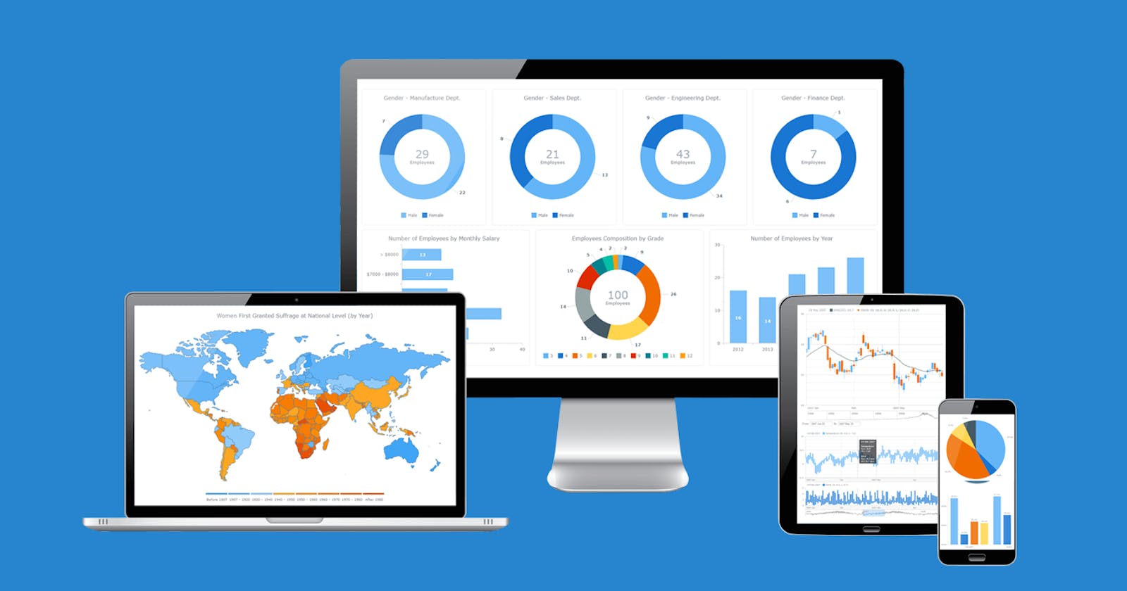
Some popular tools and techniques used in data visualization include:
Charts and graphs: Bar charts, line graphs, scatter plots, and pie charts are all examples of graphical representations of data.
Interactive tools: Interactive dashboards, heat maps, and data tables can allow users to explore data and discover insights in real time.
Geographic mapping: Mapping tools can be used to plot data on a map and identify regional patterns.
Infographics: Infographics are visual representations of data that combine charts, graphs, and other elements to create a more compelling and engaging story.
The Importance of Data Visualization in Data Science
Data visualization plays a vital role in data science, as it allows researchers to communicate their findings and insights to a broad audience. By creating visual representations of data, researchers can convey complex information in an intuitive and understandable way, making it easier for stakeholders to make informed decisions. Data visualization also helps researchers identify patterns and trends in data, leading to new insights and discoveries that might not have been apparent otherwise.
Best Practices for Creating Effective Visualizations
Creating effective visualizations requires careful consideration of several factors, including the type of data being visualized, the audience, and the intended message. Here are some best practices to keep in mind when creating visualizations:
Choose the right type of visualization: There are many different types of visualization, including line charts, bar charts, scatter plots, and heat maps. The choice of visualization type depends on the nature of the data and the message you want to convey.
Keep it simple: Avoid cluttering the visualization with unnecessary elements that distract from the data. Use clear labels, fonts, and colors to highlight the most important information.
Use appropriate scales: Make sure the scales used in the visualization are appropriate for the data being presented. For example, if the data has a wide range of values, use a logarithmic scale instead of a linear scale.
Provide context: Provide context to help the audience understand the significance of the data being presented. For example, use annotations or captions to provide explanations and insights.
Popular Tools for Creating Visualizations
There are many tools available for creating visualizations, ranging from simple spreadsheet programs to complex data visualization software. Here are some popular tools for creating visualizations:
Tableau :
Tableau is a powerful data visualization tool that allows users to easily connect to various data sources, visualize and explore data, and create interactive dashboards and reports. It is widely used in business intelligence, data analytics, and other fields that require data-driven decision-making.
Some of the key features of Tableau include:
-> Data Connection: Tableau supports a wide range of data sources including spreadsheets, databases, cloud services, and big data platforms like Hadoop and Spark.
-> Data Visualization: Tableau provides a wide range of visualization options including bar charts, scatter plots, heat maps, and geographic maps. Users can easily drag and drop data fields onto the visualization canvas to create meaningful and insightful visuals.
-> Dashboard Creation: Tableau allows users to combine multiple visualizations into interactive dashboards that can be customized to meet specific needs. Dashboards can include filters, drill-down functionality, and other interactive features.
-> Collaboration: Tableau supports collaboration through its online platform and allows users to share their work with others, comment and discuss data, and publish dashboards on the web or mobile devices.
Microsoft Excel :
Excel is a commonly used spreadsheet software that offers basic data visualization capabilities. While it may not be as powerful as specialized data visualization tools like Tableau, it can still be used to create informative and visually appealing charts, graphs, and tables.
Excel offers a variety of chart types, including column charts, line charts, pie charts, and more. Users can easily create charts by selecting the data they want to visualize and choosing a chart type from the Insert tab. Excel also allows users to customize chart elements such as axes, labels, and titles, as well as add data labels and legends.
In addition to charts, Excel offers other visualization options such as conditional formatting, which allows users to highlight cells based on specific criteria, and sparklines, which are small charts that can be placed within a cell to show trends over time.
Excel can also be used to create interactive dashboards, although this requires more advanced skills in using features such as pivot tables, slicers, and data validation.
Python :
Python is a popular programming language that offers a range of libraries for data visualization, including Matplotlib, Seaborn, and Plotly.
Matplotlib is a powerful library for creating static visualizations such as line plots, scatter plots, bar charts, and histograms. It offers a high level of customization for features like axes labels, legends, and color schemes.
Seaborn is a library built on top of Matplotlib that offers more advanced visualizations such as heatmaps, violin plots, and categorical plots. It also offers built-in functionality for statistical analysis and modeling.
Plotly is a library that offers interactive visualizations that can be used in web applications and dashboards. It offers a range of chart types including scatter plots, line plots and bar charts, as well as 3D visualizations.
Power BI :
Power BI is a business analytics tool developed by Microsoft that offers a suite of data visualization and business intelligence features. It allows users to connect to multiple data sources, create interactive dashboards and reports, and share insights with others.
Power BI offers a variety of visualization options including line charts, scatter plots, pie charts, and maps. It also offers more advanced visualizations such as treemaps, funnel charts, and box plots. Users can customize visualizations by changing colors, fonts, and other formatting options.
One of the key strengths of Power BI is its ability to create interactive dashboards that allow users to drill down into specific data points, filter data based on specific criteria, and explore data from multiple angles. It also offers natural language queries, which allow users to ask questions about their data using simple, everyday language.
Power BI also offers collaboration and sharing features that allow users to share dashboards and reports with others, set up data alerts, and schedule data refreshes.
Overall, Power BI is a powerful tool for data visualization and business intelligence that can help organizations make informed decisions based on their data.
Conclusion
In conclusion, data visualization is a critical component of data science, allowing researchers to communicate complex information in an intuitive and understandable way. By following best practices and using appropriate tools, researchers can create effective visualizations that provide insights and help stakeholders make informed decisions. As the volume of data continues to grow, the importance of data visualization will only increase, making it a crucial skill for anyone working in data science.